Saturday, November 12, 2022

Warden of the Dark Woods: Topsfield Fair Entry 2022

Welcome back to a retrospective of my entries to the Topsfield Fair, except this week is not much of a look back, since we’ve caught up to this year’s entry. I started making this picture in August, and I won’t lie: my August sucked, mainly due to the circumstances around my car. But I still wanted to submit a picture to the fair, and I wanted to get a bit more ambitious with my digital art. Thus, here we have “Warden of the Dark Woods”.


Since the Topsfield Fair mostly occurs in early October, I had wanted to make a spookier picture for the fair for a couple of years. And at the time, I recently whipped up a potential new character to play for Dungeons and Dragons (a game I only started playing last year) who visually resembles a witch.

Kiri Padparadscha (first name is decided, last name could be changed) is a Cleric of a small sisterhood devoted to the spirit of the Samhain season. Her sisterhood is suspected by some of being witches due to their garb, though others don’t mind their presence since they seem to avoid harming the people. Kiri mostly chuckles off the witch accusations, though she doesn’t deny them. Kiri is the second-youngest of four in this sisterhood, and the others took up domains one in our world could easily associate with Halloween: Twilight (oldest), Grave (second-oldest), and Trickery (youngest). Kiri’s sisters question her decision to represent the Light domain. Kiri, however, knows that Samhain ushers in a time of great darkness and cold. Thus, Kiri chose her domain (approved by the spirits of the season) to become a source of light and warmth to drive away whatever cold, dark forces threaten the people.

After watching Breadsword's video discussing the Disney movie The Black Cauldron which called it a “Halloween masterpiece”, I wanted to try making a D&D character who could represent Halloween (or Samhain) in an off-beat way. One of my big ideas was being able to cast fire magic out of a Jack-O-Lantern, but I didn’t strictly want the character to be a Wizard. (For those who don’t know, D&D has several different magic classes, and they each cast in different ways.) Hearing about the idea of children using carved-out vegetables (like gourds and turnips) to hold candles which light their way through the night, I thought about that fire and light being a protective force. Clerics are typically thought to be a support class in D&D, and the Light Domain subclass adds some fire spells Clerics wouldn’t normally learn (such as Burning Hands and Fireball) to a list which already includes several light-themed spells (like Sacred Flame and Guiding Bolt). I suppose this kind of concept could work for a Wildfire Druid, too, though for now, I understand Clerics a bit better and think it fits the concept better.

Kiri’s outfit was largely inspired by an outfit VTuber Korone Inugami occasionally wears. In addition to being an adorable outfit, I thought the colors work well for a character themed after autumn, as well as for fire due to the generally "warm" colors. Her holy symbol is a pumpkin with a Bowen knot carved into it. I tried to look up Samhain symbols, and the Bowen knot appeared often in my search, though I did try to design other leaf-themed symbols before settling on this. (Would making a Jack-O-Lantern require tinkerer’s tools or woodworker’s tools? Or something else?) I also figure she could use a hook to hold the lantern a distance away if she needs to, which could double as her mace.

Thursday, November 3, 2022

Moonphase: Topsfield Fair Entry 2021

Welcome to my fourth week of posting about my old Topsfield Fair entries. This time, I’m showing off my entry from 2021. If you have been keeping up, you may have noticed I skipped a year. I would’ve liked to submit a new image to the 2020 Topsfield Fair, but we… didn’t have the fair that year. I think we all understand WHY there was no fair in 2020, don’t we? (gives White House the stink eye)

(sigh) …Anyway, instead of making a piece of digital art in 2021, I decided to try my hand at a hand-drawn piece. My folks often comment my hand-drawn work comes out better (maybe it does, maybe it doesn’t, I’m my own worst critic), so I figured I would see how far a hand-drawn picture would go. And, of course, I would once again rely on my muse – Sakura Miyazaki – to help me through this.


Specifically, I wanted to illustrate Sakura’s self-made superpower: Moonphase. I’ve done a couple of pieces long ago about this ability, but to sum it up, she can project either an attractive force she calls “Fullmoon” or a repulsive force called “Newmoon”. Fullmoon manifests as a cyan-white disc which pulls objects toward her, while Newmoon conjures a reddish-black disc to push objects away. These discs are the centers of their respective forces and have the strongest effects right near them, though their influence could extend as far as Sakura can see. She could use this ability to pick up objects or redirect enemy attacks and later launch them back at opponents (as long as she doesn’t hurt herself with those captured attacks).

Thursday, October 27, 2022

Lucids Pop Comic Cover: Topsfield Fair Entry 2019

Remember: You can also check out my website to check out full walls of my artwork.

And occasionally, I may post on Twitter when I am doing something, @RyuKageChroma.

Feel free to stop by my Twitch when I stream, too. Haven't done so in a while, but I'd like to start that again, occasionally.


For my third entry into the Topsfield Fair Fine Arts display, I decided to go for a different style of digital art. I wanted to show off several of my original Lucids characters, and I was at the time fascinated by a Playstation 4 game I had never played: Persona 5.


For those unfamiliar with Persona 5, while the game does use typical anime-style art, there’s a recurring motif throughout the game of 2D imagery in black-and-white, often shown on a single-color background (usually red). It’s a striking style, and I thought combining such dark shadows with bright simple colors would make a striking image.

At the front (and furthest left), we have my mascot: Sakura Miyazaki, also known as “Crescendo” when acting as a Lucid. And we can see her matching her skirt color to her dress because, in my quest to make her look good but not too busy in terms of color, I decided giving her either a red skirt or a teal skirt would be best for the design, and I wanted red (a rebel’s color) to be the dominant color in her design. I also had her readying her Newmoon power as the black disc in her left hand.

Meanwhile, behind Sakura (but further ahead), we have several of her Lucid friends and allies popping out. Next to her is Ken Thunder, leading the charge with a sword in one hand and lightning in the other. While Ken considers himself a hero, he does enjoy being able to fight Dream Pirates. The other three characters are ones I mentioned on this blog in past posts years ago, but I’ve updated their designs in some ways. From closest to the front to furthest in the back, we have “The Nocturne”, Mike Anacle (maybe change that to “Anakell”?), and Wendy Krane. In whatever stories I run through my head, Sakura and Ken are the stars, while these three are more supporting characters.

One thing to note: the colors I show here may not be the colors I use for their designs now. I just wanted to emphasize a color scheme of simple, distant colors in this image.

Below them all, we have an audience cheering on these “Stars”. While “Lucid” is the catch-all term I use for these psychic superheroes, I have been debating for years on what to call the good guys. “Dream Guardians” is a bit of a mouthful, “Dream Police” sounds unintentionally sinister (especially in the past few years), and “Knights” could be a little confusing when some of these characters don’t fit the image of knights, even if it was supposed to be a play on “night”. For now, I’m settling on the term “Stars” for Lucids who protect the Dream Dimension and those who enter it. “Stars” also kind of helps for the crowd at the bottom of the image cheering these Lucids on – an audience, if you will.

Thursday, October 20, 2022

Wedding Portrait of the Unburnt: Topsfield Fair Entry 2018

Welcome back to my marathon of writing up about my entries to the Topsfield Fair. This week’s picture, made in 2018, was also intended to be a wedding gift for one of my cousins, who married earlier that summer. I received a suggestion on how to interpret my cousin and her fiancĂ©, but I was not sure how well I could execute the idea.


2018 was a time when people still had high hopes for Game of Thrones, but I will admit to this day, I have not seen a single episode of the show. Thus, I had to do some research about the characters.

My cousin (left) is garbed as Daenerys Targaryen, I think as she appeared by the end of Season 7. I chose to garb her husband (right) as Illyrio Mopatis, a character who was a merchant (fits with his IRL job) and one of Daenerys’s early benefactors. Apparently, Illyrio gifted Daenerys with the dragon eggs which he (and the rest of the world) thought were petrified until Daenerys hatched them, kicking off her career as the “Mother of Dragons”.

Thursday, October 13, 2022

Avatar VS Darkside: Topsfield Fair Entry 2017

I have been submitting my artwork to the Topsfield Fair for the last five years it has run, hoping I could get more eyes on my artwork. Since I haven’t regularly made money off my artwork yet, I enter as an Amateur in the fair’s contest, rather than as a Professional. I wanted to show off and discuss my entries sooner, but I kept delaying it until now. So, as I mentioned last week, for the next few weeks, I will be providing quick write-ups about these pictures.


The first year I entered the Topsfield Fair’s Art Contest was 2017, where I entered this image of my OC Sakura Miyazaki and… herself two more times. Material World Sakura (center) is feeling horribly low, but her inner positivity and inspiration manifest as her Lucid Avatar (left). While she is looking toward the bright side, however, Sakura is still being buried under a manifestation of her inner negativity, her personal Darkside with ice powers (right).

Whenever a Lucid awakens to their abilities in the Dream Dimension, they unwittingly create a Darkside, a personal Nightmare created primarily from their denial, secrets, guilt, and other fun negative qualities. A Lucid’s Darkside may arise within their mind to destroy them during especially low points of their lives, and they often threaten to destroy their host through “self” sabotage, which may manifest in the Material World.

Thursday, October 6, 2022

My Pokemon TCG Illustration Contest 2022 Entries

When The Pokemon Company announced in October last year they would be holding an art contest where the winners may have their art turned into a trading card, as both an artist and a long-time fan of Pokemon, I was in. I ultimately submitted two entries, and although I didn't make it past the first round of judgment, I was glad I entered.

THE CONTEST

The prompt for this contest was to draw a Pokemon going about its day. Vague description, but those give you plenty of room to play. They had certain Pokemon you had to choose: Pikachu, Bulbasaur, Charizard, Arcanine, Scizor, Greninja, Cramorant, or Galarian Rapidash. You could submit up to three entries total, which could be all different Pokemon for each or all the same one. But the Pokemon you chose for each entry had to be the main subject of the image.

If I remember correctly, the contest was announced in September 2021 and then opened in October and would remain open until the end of January 2022. Unfortunately, I half-forgot about the contest until sometime in December and then got to work. In the end, I submitted two entries.


GRENINJA

I chose Greninja as a subject because it's one of my favorite starter Pokemon and because I thought Greninja would give me a lot of fun movement options. As an anthropomorphic frog, I imagine it could run, jump, and swim well, but while I think jumping could've been cool, I thought climbing or wall clinging would be a unique take. Thus, I set this image in a forest by a river. Greninja would be clinging to a tree and swinging himself out to peek around for a better view.

I tried to add bits of water to give the impression he had recently emerged from the water. I also lowered the opacity on the webbing of Greninja's hands and feet.

Maybe I put a little more work into the background than I intended, with the river reflecting the land above it. If you look closely, I tried to add a few more Water Pokemon swimming in the river: the lilypad tops of two Lotad and the buoyant tail of a Marill. That stone tower was a landmark I thought of to give the background some extra depth. It's sort of based on a stone tower in the woods near my home, but I wish I had gone with something with a little extra flair.

GALARIAN RAPIDASH

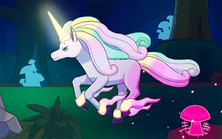
Back when Pokemon Sword and Shield were new, I was inspired enough to draw a picture of Ponyta's then-recently-revealed Galarian form, trotting through a dark forest (its apparent natural habitat in Pokemon Sword and Shield). I chose to draw Galarian Rapidash as an evolution of that older image, literally.

I really wanted to emphasize color with this image. This form of Rapidash is a rather colorful Pokemon, with white fur for its body and soft pinks and mints for its mane. Using certain powers or certain attacks may also cause its horn to glow a soft yellow, with its mane flowing with the color during use. I figured the glowing horn could also be a source of light for Rapidash in their dark forest environment (I don't know how good Galarian Rapidash's eyes would be in the dark).

Speaking of the forest, I also wanted to make sure the forest got a chance to shine. The area where you find Rapidash's unevolved form Ponyta in the Galar region is the Glimwood Tangle, a forest illuminated mainly by the glow of mushrooms. Thus, I wanted the shine of these mushrooms to play a part in the lighting of this image, which would also add additional color. I probably could've done better with this aspect of the image, but I'll get to that below.

If I gave myself time to draw a third one, btw, I was torn between drawing Arcanine or Scizor, because I figured those two could've been interesting to draw but maybe less popular choices. However, an Arcanine drawing ultimately won the contest, so what do I know there? Still, an Arcanine drawing is now on my to-do list (Kantonian, anyway. MAYBE also Hisuian form another time.)

Monday, October 3, 2022

It's Time to Raise the Curtain...


How's it going, folks? I'm Ryu-Kage, and if you haven't seen this before, this is my art blog. Here, I upload artwork which I complete and feel confident enough to share, as well as discussing details about the pictures and my thought process when making them. ...At least, that was the intention about eleven years ago when I started this blog. You may have noticed I have not uploaded in about six years, though.

Why haven't I uploaded in such a long time? To be honest, I don't know if I can explain myself well. Probably a combination of losing confidence in my skills, not drawing as frequently as I once did, and losing sight of even uploading things. I can't say I am in a very good position right now, but I thought pushing myself to upload my pictures somewhere and talking about them would help me regain some confidence and control of my life. I have always to draw, and I should be proud of what I can do.

What's the plan going forward? First of all, I intentionally was writing here using as few apostrophes as I could, but if you haven't noticed yet, I will be dropping that affectation. It's a relatively minor change, but a change nonetheless. Click below for further plans going forward.

Friday, November 11, 2016

Pokemon: Clefable

Back in April, I tried to sell some prints of my Pokemon artwork at PAX East, some of which I had uploaded to the blog, others I had not.  One print I had involved two Pokemon from the original games which enjoy competitive popularity today: Clefable and Dragonite.  To be honest, I drew the Clefable as part of a different image and had planned Dragonite as an additional element for that image.  For now, I want to talk a bit about the Clefable I drew.


Saturday, October 15, 2016

Copic Coloring & Sakura Miyazaki Recolor Project

At some point last year, I took an interest in Copic markers, a set of markers meant to be used to shade drawings. Usually, if you color a picture, while markers produce vibrant colors, the same bold color makes it difficult to shade or blend the markers if you have so few. Luckily, Copic sells 358 different colors of markers, which may be an overwhelming selection until you learn about the codes they grant each color. Every Copic marker has an alphanumeric code which tells you the appropriate way to use it if you shade, usually in the form of “R24” or “BG13” or something like that. The letters correspond to the color family of the marker (for example: “R” for red, “B” for blue, “BG” for blue-green / cyan / teal, “E” for earth colors), the first number identifies a brightness / shade / “purity” within that color family, and the last digit tells how light or dark the color is (0 is the lightest, 9 is the darkest). It reminds me of the hue, saturation, and luminosity values when you pick colors on a computer, except it can now be applied to ink. Apparently, you can shade with these markers by layering several colors of the same “hue” and “saturation” but different “luminosities”. It was an intriguing concept (which I only discovered last year), and I was curious about these markers.

Unfortunately, Copic markers are quite expensive. If a concrete arts & crafts store sells them, individual Sketch markers are about $8 each. Packs of three, six, or twelve sorted for their shading purposes are obviously more and not much of a discount (if any), and they are sometimes gated off from the rest of the merchandise. Since I arguably spend more time making art through the computer rather than physical prints (which I should do), I was unsure how often I would use these markers and which ones. Copic drawing in real life may not work so well, so I took a different approach to testing these markers.

I searched online for a complete color palette of Copic colors I could load into Photoshop. Copic provides the palette themselves, and the colors from that look just like the colors displayed on the website. However, after testing them out their palette, I thought the colors I got from it were too light and faded. Though I have not gathered many Copic markers, I did receive a few for Christmas, and compared to what I was seeing on the screen, the real deal seems much darker and more vibrant. Thus, I kept searching online for substitute palettes, preferably one made by the real markers.

Eventually, I found this chart from a DeviantArt account called Jad-Ardat, where the uploader organized every single marker into a graph and colored each square with the appropriate color. They put a lot of work into this, and I am grateful they did, because these shades looked much closer to what I was seeing from the markers I had used. I decided (once I blended the inside of each square because it was still noisy in most of them) to use this palette and test it on my drawings going forward this year.


Final Design Possibilites: near-white-blue (porcelain) vs pale blue (frost)

For one of my first drawings with these Copic colors, I decided to test them on my little moon mage, Sakura Miyazaki, but I also tested these colors because I have been considering a redesign for Sakura’s palette before I start working on my “Lucids” stories. Eventually, I ended with the images below as my finalists, and I would love some feedback on which version you prefer. Before that, though, an explanation for why I would recolor one of my classic characters.


Friday, June 3, 2016

Twitter Page and Logo

Before I go into the new image I want to show, I want to let you know right now, I have a Twitter account now: @RyuKageChroma.  For a long time, I did not sign up for Twitter because I was not fond of the tight limits on what you can type per post.  However, I decided it would be a quick way to share some of my thoughts on games or events happening, as well as one more outlet to share my artwork with a wider audience, both originals and fan art.  I will be posting there and here, as well as my personal Facebook page whenever I can motivate myself to do so, and I plan to use them more frequently than I have been.  Hopefully, I can keep that promise this time.  Ha ha.

Click here to see my Twitter account: @RyuKageChroma

In the meantime, let me share a revamp of my old logo, the Mark of the Red Dragon.